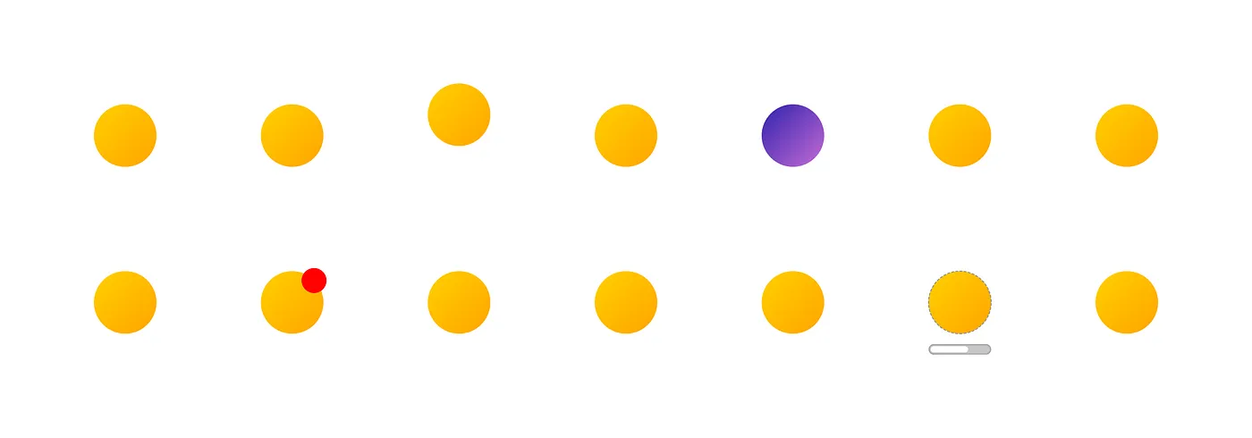
Visual indicators are used to make certain items stand out from the crowd. They don’t require the user to take action, but act as communication tools to cue something noteworthy. Indicators are not always present but appear under certain conditions. To communicate their message, indicators can take the form of icons, typographical styling, enlarged size, color variations, animation, and more.
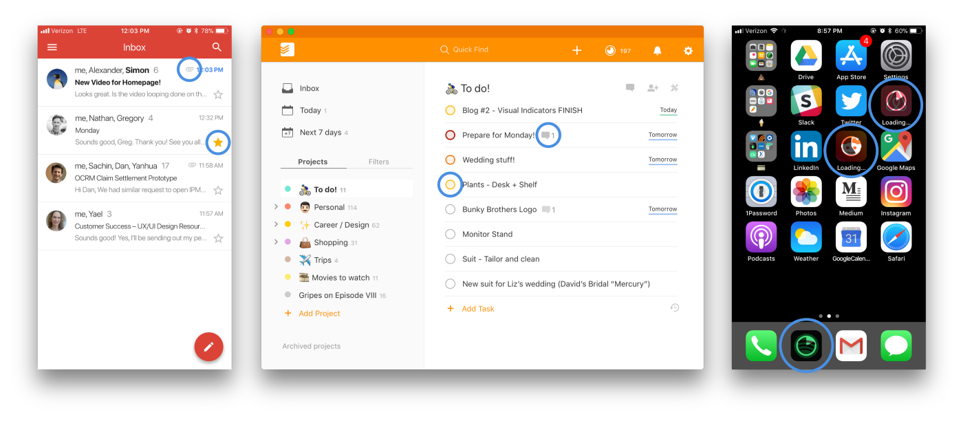
In the digital world, examples of indicators can be found everywhere. Gmail, for example, uses paper clip icons to show which messages have attachments and yellow stars to mark saved threads. Users of Todoist indicate an item’s priority by the checkbox color and can easily see which ones have comment history. When updates are downloading, progress indicators overlay app icons on iOS to show the user how much download time remains.
One thing I love about working in UX and interface design is that the principles and elements extend beyond digital products. Indicators, like affordances and signifiers, exist in the world around us, communicating messages about the entities they represent. The most explicit method of using visual indicators is with added text, such as marking items in a department store with “20% off!” tags.
For this exploration, I wanted to focus specifically on non-text indicators that exist in the physical world. Rather than added text, they use color, orientation, and movement.
“Visibility of system status” is one of Jakob Nielsen’s 10 Usability Heuristics for User Interface Design, which states that any system should always keep users informed about what’s going on. With a similar purpose in the physical world, visual indicators are a very common means of communicating status.
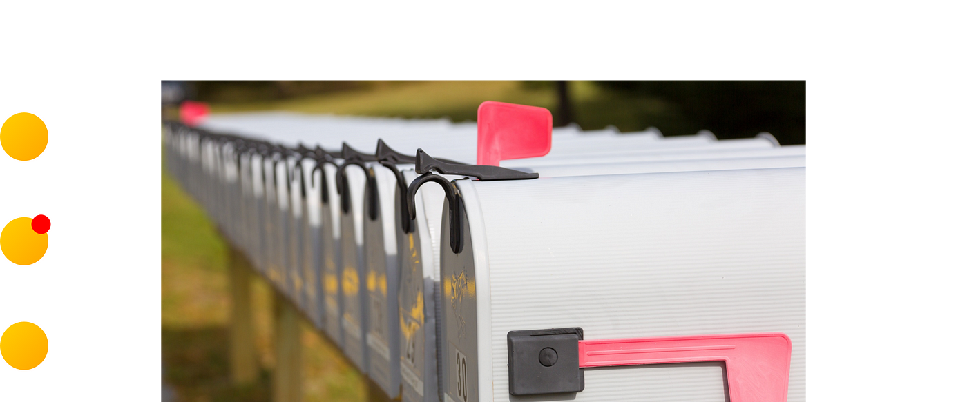
Item: Mailbox
Indicator: Flag in the “up” position [Inbound / Outbound Status]
Intended For: The postal worker
Message: “Hey, there’s mail in here to be collected!”
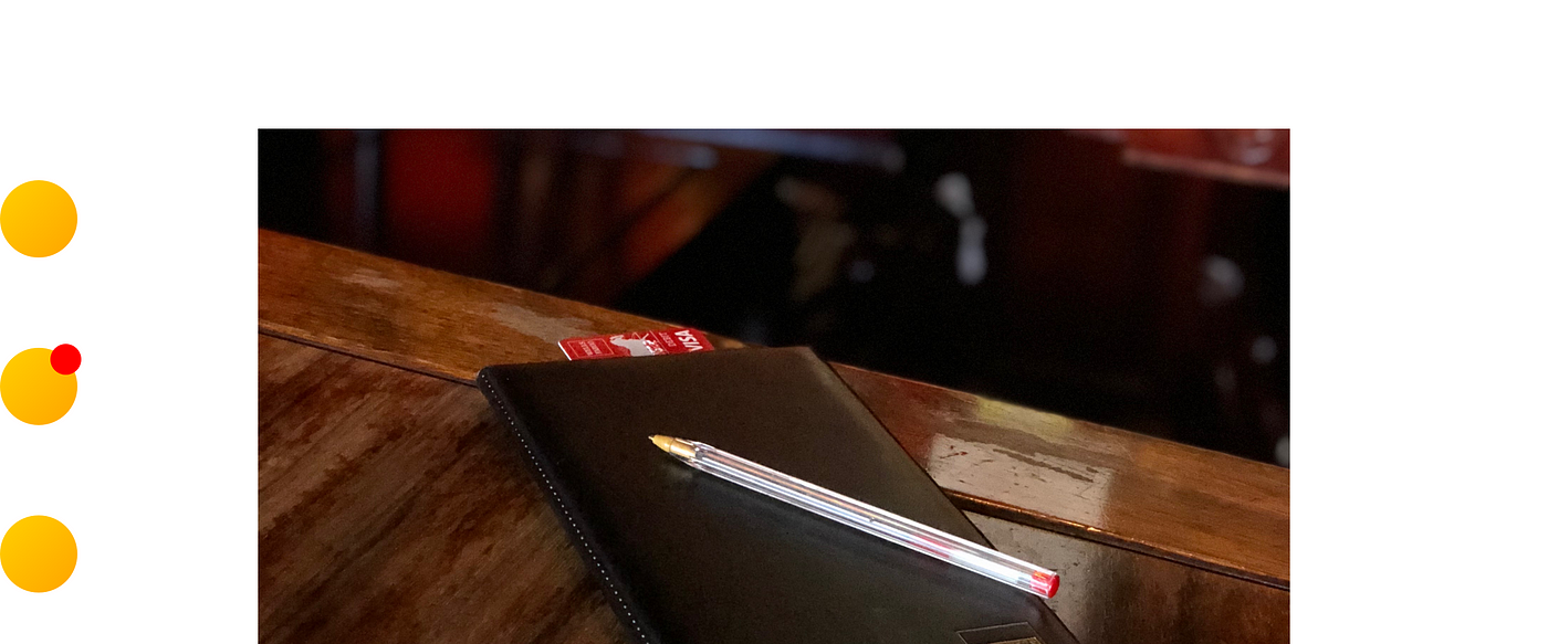
Item: Restaurant bill
Indicator: Card sticking out of bill wallet [Payment Status]
Intended For: Wait staff
Message: “Payment method is ready to be processed!”
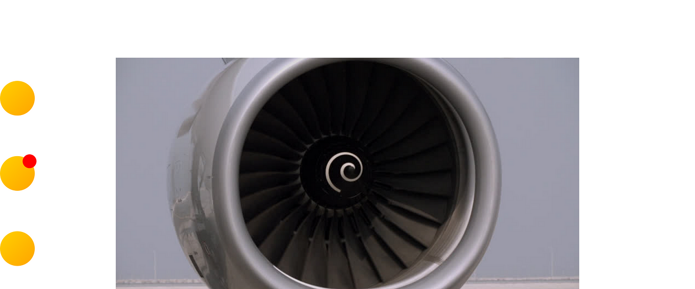
Item: Airplane turbine engine
Indicator: Spiral graphic in motion [On / Off Status]
Intended For: Airport ground crew
Message: “Watch out! This airplane’s engine is running.”
Bonus: This indicator may help ward off birds!
How many [increments] until [this thing] is [complete]? Progress indicators are very common in digital products to communicate the remaining amount of time or steps a user has between them and the end of the process. In the physical world, they manifest as markers that communicate a remaining increment or time until a status is reached or action is needed.
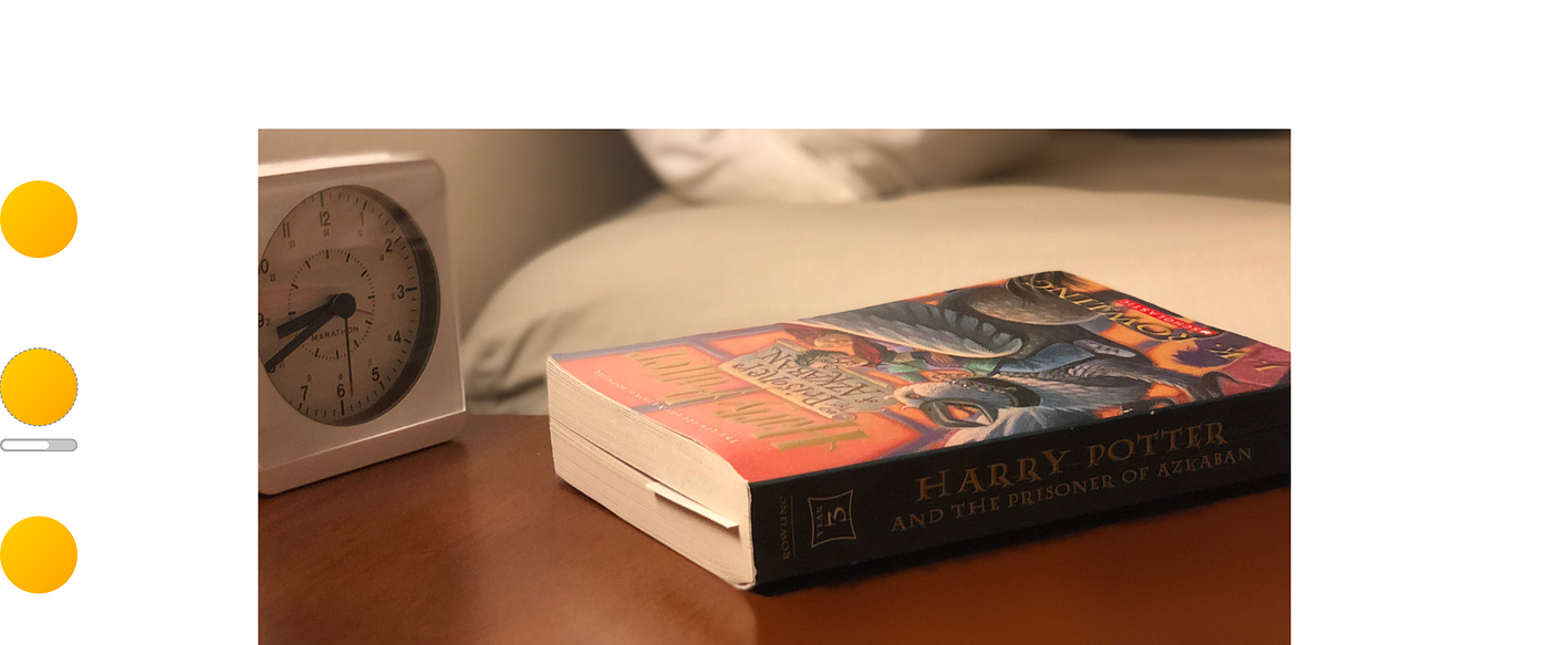
Item: Book
Indicator: Bookmark placed in a certain page [Completion Progress]
Intended For: The reader
Message: “Look how far you are in this book! You’re about halfway to completion.”
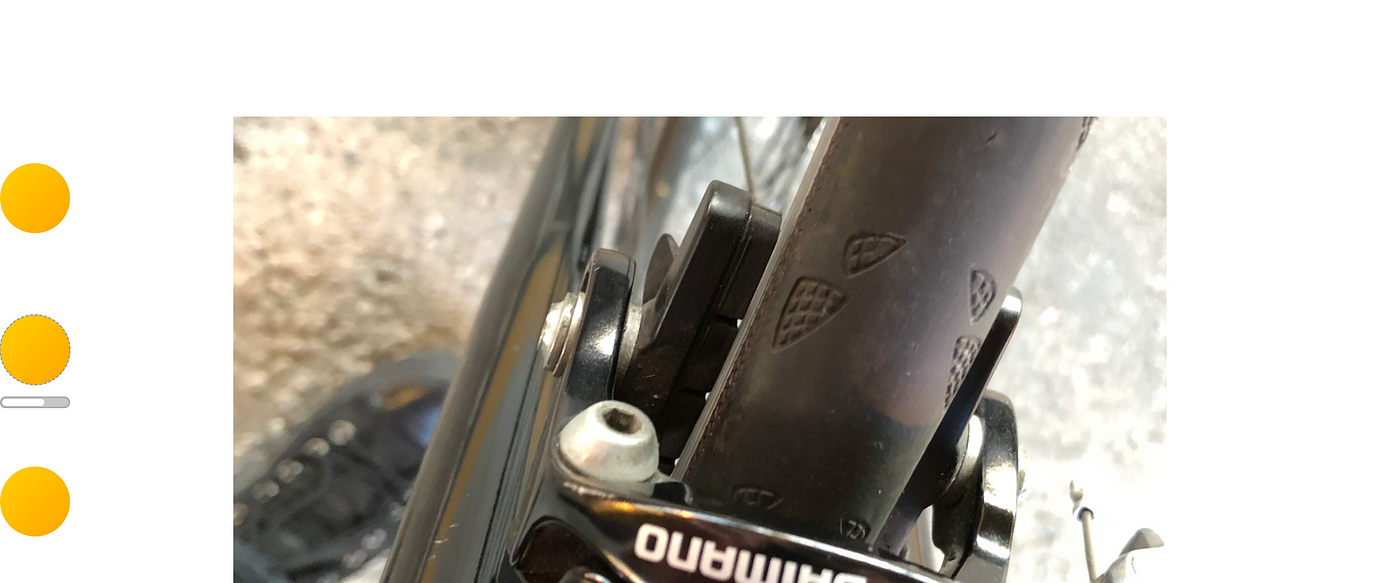
Item: Bicycle brake pads
Indicator: Amount of wear in grooves [Usable Amount Remaining]
Intended For: The cyclist
Message: “These wear grooves are almost gone. It’s time for new brake pads!”
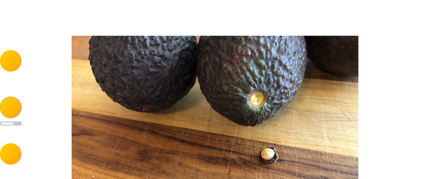
Item: Avocado
Indicator: Color underneath the stem [Ripeness Spectrum]
Intended For: Shoppers and hungry guacamole-makers
Message: Brown color = “I’m overripe / bruised.” Green color = “I’m ripe and ready to eat!”
I’m always looking for creative ways to answer questions before they’re asked. Anticipating what people are looking for can remove sources of confusion where possible. I’ve found these indicators helpful to create clarity for others and myself by communicating a message without saying a word.
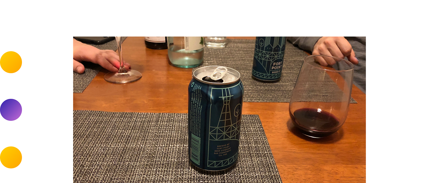
Item: Beer can
Indicator: Dent in the can [Ownership]
Intended For: Anyone thinking about stealing my beer
Message: “This is not your beer.”
Bonus: Wine glass markers (and towel charms 🙄) work the same way!
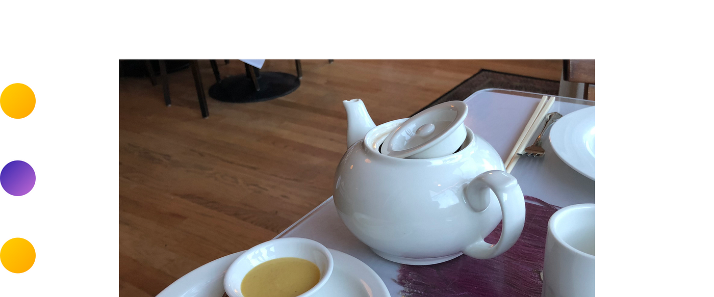
Item: Restaurant teapot
Indicator: Placement and tilt of the lid [Empty / Full Status]
Intended For: Wait staff
Message: “This teapot is empty. Can we get some more water, please?”
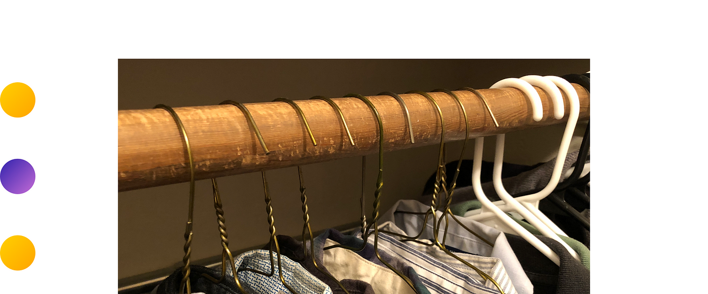
Item: Collared Shirts
Indicator: Clothes hanger hook placement [Clean / Worn Status]
Intended For: Me!
Message: Hook facing out = “This shirt is clean.” Hook facing in = “This shirt has been worn at least once.”
Indicators like these do not speak for themselves. However, in the right context, these visual cues can help users differentiate one item from another. What the user does with this communicated message is dependent on their immediate need or end goal. In both the digital and physical world, visual indicators are here to help.
This article was originally published to the UX Collective on Medium.